
Shopping in store is so 2019
Mirror has a very strong brick-and-mortar presence, but has not established a strong digital presence. Their current web site is informational only, and they recognize the need to venture into online sales to respond to customer demand and assist in clearing excess inventory. Mirror would also like to update their logo to a more modern, clean and fresh new look.
With over 400 locations in 32 countries, Mirror caters to all ages, sizes and occasions, and offers good quality and low prices, allowing consumers to change their personal style easily as trends come and go.
Mirror is a fictional company for a DesignLab UX Academy project
Who, what, why?
I performed an in-depth competitive analysis as well as user research via 21 survey respondents and 3 in-person interviews to address the following questions:
-
How are close competitors navigating the online space?
-
What drives a shopper to purchase online as opposed to in-store, or, conversely, in-store as opposed to online?
-
How do consumers use their current go-to shopping site?
-
What are their pain points or positive experiences?
-
How do users navigate a site to best find desired items?
-
How do consumers best respond to sale messaging?

What did we learn?
The retail clothing market is incredibly competitive, with options to suit everyone's personal size and style. 82% of survey respondents shop online for clothing at least a few times a year, and they all have different favorite sites, with responses ranging from "superstores" like Amazon and Target, to discount online-only sites such as Shein, to traditional mall offerings like Gap, Old Navy, and J. Crew. Users like an interface that is easy to navigate and user-friendly, and check-out that is quick and seamless, with the ability to tie in coupons, rewards, and payment in minimal clicks. They don’t have much patience for glitches and technical difficulties and a poor experience might stop them from coming back.

In-Store Shopping
Benefits
Try things on
Instant gratification
Easy returns

Online Shopping
Benefits
Convenience + time saving
Ease of finding specific items
Sale + clearance

57%
shop on
mobile
Must Haves for
Online Shopping
Mobile friendly
Sales + rewards programs
Easy to navigate
Introducing...our VIP
Lindsay Jones, a busy working mom, informed many of the decisions made regarding the Mirror web site, including simple navigation and filters, easy access to customer service functions, and the bright, family-friendly UI design.

What's the end goal?
Keeping in mind results of competitive and user research, as well as the wants and needs of the client, I outlined overall project goals.

What goes where
Remember our VIP, Lindsay? She doesn’t want to hunt for information. She wants what she’s looking for to be sorted in an organized manner. I talked to our users to learn what makes the most sense to them.
Limited Card Sort
4 participants, all female, from age 16 - 75
Goal: would participants keep simple categories, such as “tops”, “bottoms” or into groupings such as “work wear” or “active wear”?
Results
-
One participant sorted strictly by item type
-
Three participants sorted by occasion-based categories
-
Both groupings are important!


Lindsay goes shopping!
Based on my research, I envisioned our VIP, Lindsay, visiting Mirror for some back to school shopping for her kids, and the various paths she may take through the site. Everyone searches in different ways - some users use a search bar, while others browse promotions that are on the home page or use site navigation to find their category of interest. Robust search features that are easy to navigate for even a new user are key.
.jpg)
Mid fidelity wireframes
Before I could focus on the fun part of making the site look pretty, I had to focus on making it functional, with intuitive search and filtering features, clear and concise product information, and a mobile experience that wouldn't frustrate the user.


What's it going to look like?
The mood board reflected a fun, playful style that could appeal to kids and their parents but wouldn’t isolate adult shoppers.
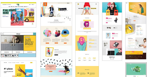
Branding + Style Tile
Mirror branding is fun and family-friendly. Bright, bold colors are offset by a modern san-serif font and casual “everyday people” photo styling.

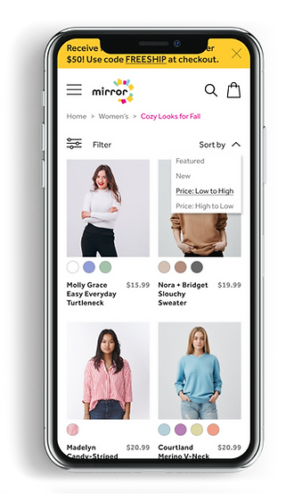
Desktop - UI Design

By applying my branding and styles to the mid fidelity wireframes, I created an interface that is fresh, fun, and easy to navigate. Visit the live prototype here.


Mobile usability, please
Research clearly indicated that mobile is king, across all age ranges, with 57% of survey respondents stating they primarily shop on mobile. A mobile site that is simple to use is a necessity for Mirror users.


What did everyone think?
Usability testing was conducted via Maze with 6 participants. Overall, feedback from users was positive. Some concerns came up regarding the shopping bag confirmation screen and mobile filters. I made several changes to the UI design based on user feedback.

Priority Revisions
Shopping Bag Confirmation
Problem: Users did not feel there was enough information on the bag confirmation screen.

Version 1

1
2
3
Version 2

Version 1

1
Able to remove item from shopping bag
2
Can change selections for color and size
3
Status bar to show progress to free shipping
Version 2
Filter Icon
Problem: Majority of testers did not select the filter icon correctly on the first try

Version 1

1
2
1
Changed icon to stand out more from the hamburger icon above
2
Revised text to be more descriptive and fit brand tone
Version 2
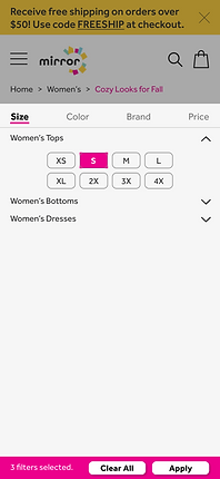
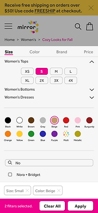
Mobile Filters
Problem: Users needed more feedback during the filtering process
Version 1
1
2
3
Version 2
1
2
3
Sections scroll when category on top is selected, rather than opening a new tab, therefore reducing amount of white space and allowing user to see and change previous selections more easily
Selected filters are shown at the bottom of the screen, and can be cleared individually or with one click
Buttons are larger and in closer proximity to selections, making them easier for a user to spot
How did we do?
After user and competitve research, developing a persona and user flows, structured information architecture, brand development...did we accomplish the company and customer goals?
-
User-friendly site design
-
Easy to search filters
-
Clear excess inventory / Bargain hunting for sale and clearance items
-
Modernize logo and customer experience
-
One-stop-shop for all members of the family

Mirror has a strong starting point to enter the retail ecommerce space - they’ve created a positive experience for their existing shoppers and can better compete to gain new ones.